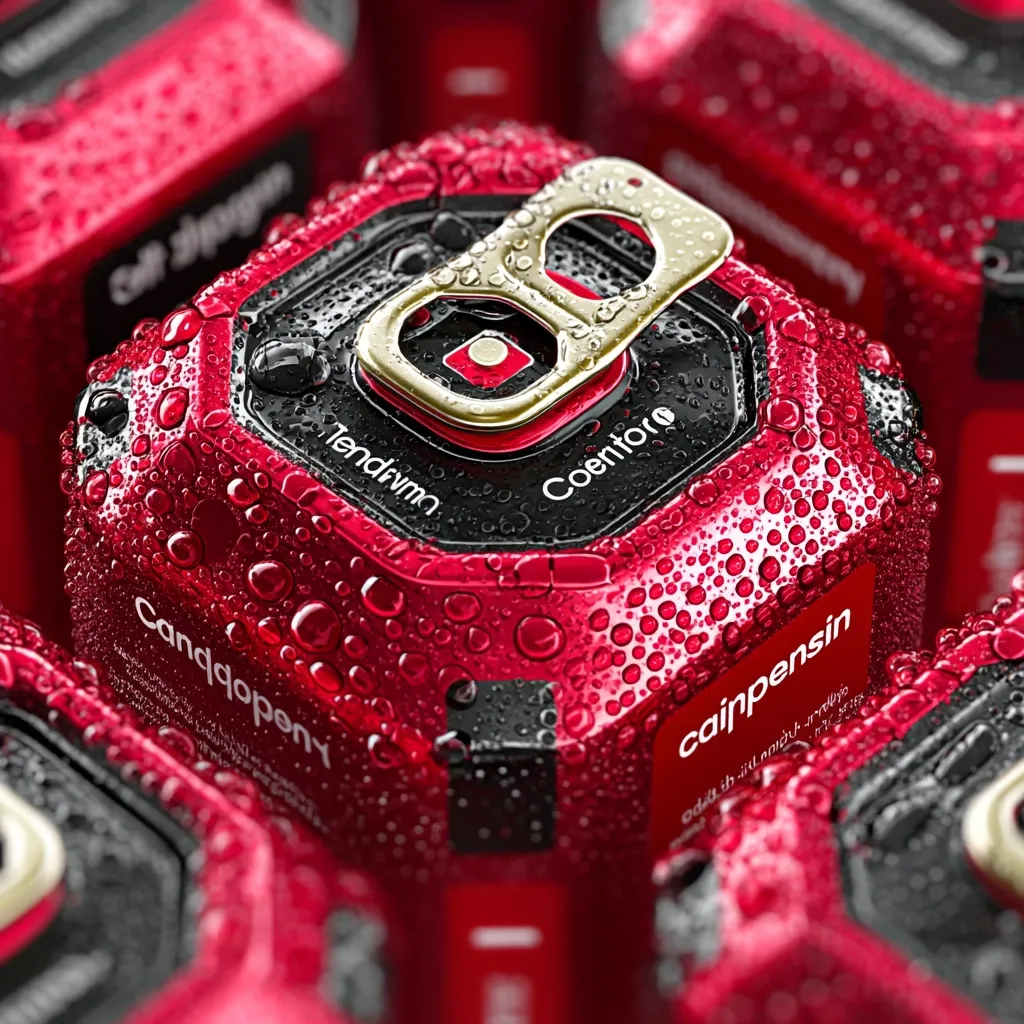
Chilled, hexagonal cans with gold pull-tabs and unique branding.
description
Close-up view of several red cans covered in condensation. The cans feature a unique hexagonal design with a prominent gold pull-tab. Text is visible, including "Coentor" and "cainpensin," suggesting branding. The image emphasizes the wet, chilled nature of the beverage. The overall aesthetic is modern and sleek.
In a world constructed by Thiessen polygons, these nine red soda cans can be fully observed from above, redefined as geometric organisms through spatial segmentation and transformation. Each can is divided into multi-edged regions and embedded within a honeycomb-like network, where the pull-tabs align precisely with their nearest neighbors. The surface of each can extends into partitioned graphic zones, and the bubbles spread along hexagonal paths, reminiscent of cellular division in nature. Label designs fuse seamlessly into sharply defined boundaries, while the metallic shell reflects its associated neighborhood relationships. Gloss flows rhythmically across the zones, creating a symmetrical visual cadence, and the brand typography is embedded at the geometric centers, guided by directional logic. The edges of the cans are sealed tightly, structured like a graph-theoretical diagram, while shadows are cast with precision along the polygonal control boundaries. Internally, the structures are interconnected through geometry-driven relational networks, unfolding spatial adjacency through the seams. Much like topographical surveying, textures follow geodesic distributions, and even the can bottoms are clearly demarcated within their respective functional cells. In this world, the pull-tabs respond to regional assignments, and metallic fractures extend naturally along planar divisions. The overall form adheres to the principle of spatial partitioning, with internal layers reflecting the structure of nearest proximity with mathematical precision. --v 7.0 --s 750